
Whether you are moving into a new space or trying to reimagine a room in your home, it can be hard to narrow down a colour scheme. Trying to find a look for a room that will fit your lifestyle, your personal taste and stand the test of time is no small feat. As a builder’s merchant, we know just how quickly trends and styles can change, and it can feel hard to keep up.
If you are looking for colour scheme ideas, read on to discover some tips for determining your own colour scheme and then suggestions for the most important spaces in our homes.
Assess your space first
Unless you are moving into an empty house and are yet to purchase any furnishings, it’s a good idea to assess your space before picking a colour scheme and heading out to buy paint. Look around the room you are wanting to decorate; what colours are already in the room? Think furniture, carpets, and tiles. If you are wedded to any of these items, then it makes sense to plan your colour scheme around these existing items. Start to think about what colours might go well with what the room already has to offer.
If you are starting from scratch, remember that furniture, rugs, and carpets are much more expensive than paint, so it makes sense to start here when identifying a colour scheme for the room. You can then adapt your wall paint to these harder to replace purchases. So, whether you are looking to find the perfect home office colour scheme or great colour schemes for hallways, take the time to assess the space first and buy your wall paint last.
Use a colour wheel
At the start of your mission to find the perfect colour scheme, it’s a smart idea to kick things off with a colour wheel. You can get a bunch of awesome paint ideas by utilising this simple tool, which allows you to identify colour combinations that work well together. This is an awesome tool for making decorating decisions as people often have a tough time working out which hues will be compatible. A colour wheel is divided into 12 basic hues, which are divided into three primary colours, three secondaries, and six tertiary colours.

Primary colours: red, blue and yellow (pure colours which cannot be created from other colours on the wheel).
Secondary colours: orange, green and purple (formed when equal parts of two primary colours are combined).
Tertiary colours: a mixture of primary colours and secondary colours that are next to it on the wheel.
Once you understand how the colour wheel works, you can utilise it in your decision making, as its segmentation will help you to mix colours, create different palettes, and ultimately find a colour scheme that suits your personality and your space.
The four main colour schemes
The best way to approach your colour wheel is by looking for a base colour you love and then applying the four main colour schemes to it in order to expand that one colour to a full scheme. This way, you’ll be able to choose a main colour that you love and ensure your accents and accessories fall in line with it.

Monochromatic – Monochromatic is the simplest of the schemes and will just have you using different tones and shades of your base colour. So, as you can see in the graphic above, if your base colour is red you may end up with a light pink or perhaps a darker burgundy. This can be a great way to create a real statement area in the home.
Analogous – To find your analogous colour scheme, you need to look at the colour wheel and the colours that fall to each side of your base. Using red as an example again, this could mean that you partner it with a dark orange or even a magenta. This way, you’ll have similar colours in their warmth without having one, dominating tone.
Complementary – If you are looking for accents that really pop against your base colour, complementary is the way to go. Again, using the colour wheel, find your base colour on the outside ring and then determine the colour on the opposite side of the wheel. This is your complementary colour.
Triadic – Finally, for those who want a more complex scheme with a range of colours, triadic takes one step up from complementary and asks you to create a triangle on the colour wheel from your base colour, showing you three contrasting colours that together, will create an eye-catching and cohesive scheme.
Laura, who shares her tips and advice on home interiors via her blogs Spilling Life Tea and MissLJBeauty, reveals the tip she received from a friend regarding the creation of a monochromatic colour scheme: “When you are choosing paint at the paint shop, take the little cards with the colours on them. You know the ones that start at the lightest colour and go through the range to the darkest ones. These colours are great as they give you a palette to work with. You will know that the darker colours will complement the light ones. So, you can buy your soft furnishing in these colours and they will perfectly complement each other.”
Consider how light impacts colour
Colour is a reflection of light, so considering how the light in your room will impact your colour choice will be a key part of narrowing down your colour scheme ideas. Each room will be different, with varying levels of natural light and being home to different artificial light sources such as lamps. As a result, the types of bulbs you utilise will make a difference to how your paint looks. The lower the Kelvin, the warmer the colour will be and the higher the Kelvin, the cooler it'll look (see graphic below).
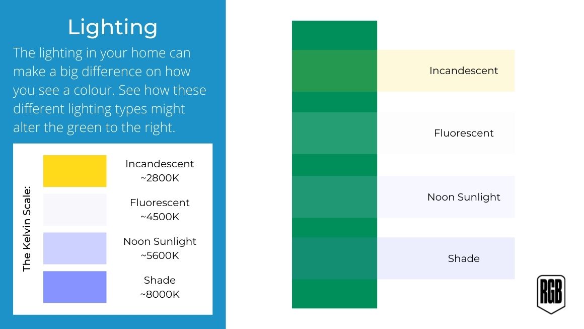
Daylight shifts throughout the day, changing a colour’s hue in the process, so you should spend some time in the space during different points of the day to see how the light impacts your different colour scheme ideas. For example, you might have a room that receives very little daylight due to its position, therefore a warmer colour scheme might be a shrewd move.
Also, consider how you use the space. Is the room in question mainly used at night-time? Well, it would make sense to identify your colour scheme under the conditions in which it will be utilised, with the lamps and artificial lights that will be present.
Take into account the type of space you have
Just as light can play a huge role in how the colours you choose are perceived, so can the space you have. The colour palette you choose to use can go a long way into how a room feels in terms of size and mood, so making sure to take into account the area you want to repaint is a big part of choosing a colour palette. Look below to see some of the ways you can change the appearance of a room’s dimensions with paint.
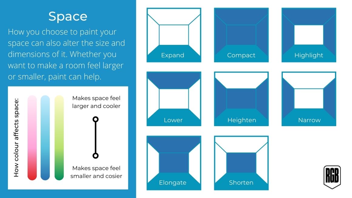
Along with this, the colours that you use can have a dramatic difference also, with darker and warmer colours closing a space up and making it feel smaller and cosier, whilst lighter, cooler colours give spaces an airier and calmer feeling. Pairing the right colour with the right painting layout can be the biggest way to change the feel of a space by only changing one thing.
Test out your colours
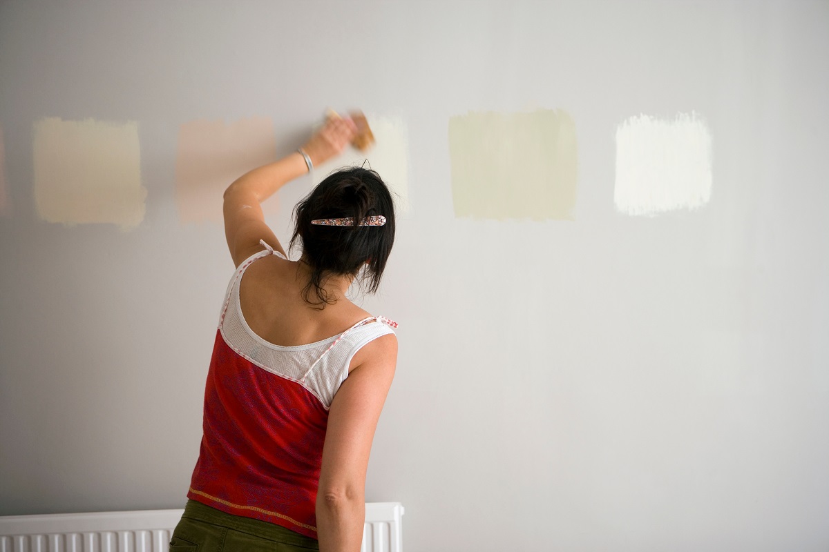
Once you have your colour scheme in mind, you can start testing to see if it’s right. A good place to begin is with a floor plan of your home, writing down your chosen colour for each room, as understanding how one room will flow into the other will be a major part of any decoration project. Once you are happy with this step, pick up some paint samples and test them on the walls. Always sample your paint before committing as you will want to get it right the first time instead of forking out for litres of paint and then realising you made a mistake.
Paint always looks different when it is actually on the wall so, pick a few shade samples, test them in small areas on a wall next to each other and sample them on multiple walls. And as with the actual painting process, test your colours with two coats so you can get a true idea of what the colour will look like.
Happy? Great, now you can commit to the colour scheme and throw yourself into the decoration process.
Remember that taste is personal
Following trends and schemes you see which have a large buzz online is all well and good, but you need to remember that taste is personal and the scheme you decide on should be one you truly love, not just one that you think others will love.
Jo, from the lifestyle blog Tea & Cake for the Soul, told us how she personalises her space with accessories: “I have a tried and tested method for creating the perfect colour scheme at home. I keep all my walls a neutral colour such as white or cream and then inject colour with accessories. I buy cushions, curtains, and rugs in bright colours, and will often paint upcycled furniture or picture frames to match the new colour scheme.”
Something you can do with this method is change your scheme to reflect the seasons, Jo tells us: “Cool blues, pastel yellows, and mint greens are great for summer, but warm your rooms up with reds, oranges, and hot pinks and purples in winter. It makes it easy to update your rooms on a budget.”
READ MORE: How to style your kitchen for every season
Laura, from Spilling Life Tea, also adopts this method in her space, telling us: “I recommend choosing neutral colours for your home. Neutral colours not only add light to your home which will elevate your mood but are easy to work around. I like to add bolder colours to my home in the furnishing. These are a lot easier to change out than to cover up. That bright green statement kitchen you once loved can easily turn into a nightmare. Yes, I am speaking from experience.”
She also shares her advice to those who may be interested in a bolder colour scheme: “If you want to experiment with bold colours, start with a feature wall and see how you like it. This way if you change your mind, you can change it back with little effort.”
Laura also discussed with us that the lifestyle you have can be a contributing factor to your decision: “Whilst paint is not forever, it can be an incredible task to remove if you choose the wrong colours. You have to also take in to account your lifestyle. If you have children or pets, for example, you want colours you can easily touch up.”
Popular colour schemes for different rooms

Lounge colour schemes
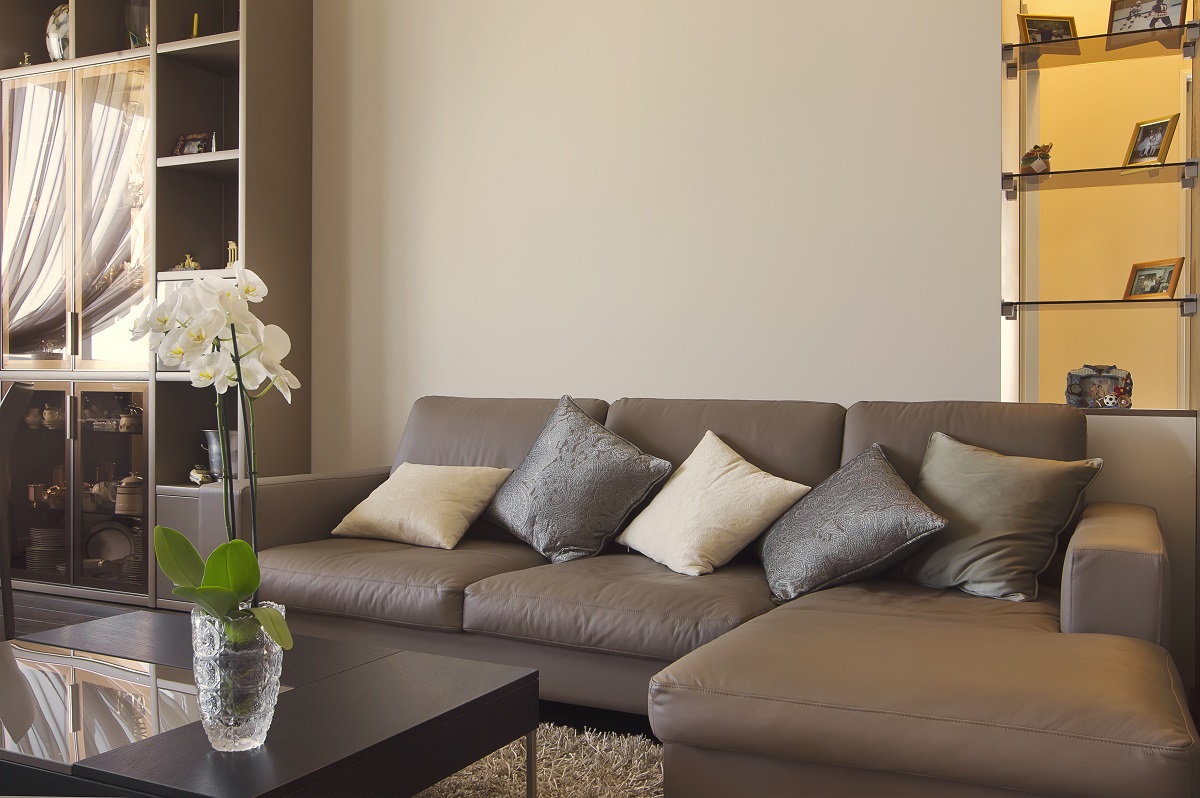
Colour schemes are certainly personal but there are certain schemes that work well for particular types of rooms. When it comes to living room colour schemes and lounge colour schemes, cosy is often the desired approach as these are rooms we want to settle in and feel comfortable despite what the weather might be doing. So how about the ‘coffee with cream’ approach? By utilising a mixture of neutral browns, creams for the sofa, cushions, and carpet, with light grey walls and other coordinating elements, you can create a warm and inviting living area to sink into.
Or how about an autumnal approach? Utilise rich autumn colours such as the colour wheel neighbours of orange and gold, mixed with shades of brown, tan, and beige for a lounge you will never want to leave. Leather footstools, dark wooden picture frames, deep orange walls, and golden accoutrements such as rugs, vases, and lampshades will be key to making this look happen.
Ben, a handmade furniture designer and maker, as well as home, garden and DIY blogger at Wood Create, recently went daring with his living room colour and he loves it. He told us: “Rather boldly we changed our living room colour scheme from play-it-safe neutral beige to bright and bold orange! We weren't sure it would be a success, but we love it. We have two bright orange sofas, orange cushions, throws, plant pots and other decor pieces incorporating the orange theme. In the winter it proved to be a warm and cosy colour, yet in the summer it works as a bright and cheerful colour, making it a great choice for all seasons.”
For something a little less vivid, Petra from A Mum Reviews tells us how she loves her theme: “For our living room we have chosen a grey and yellow theme - which both happen to be the 2021 Pantone Colour of the Year (though we did decide on this back in 2019!).”
Talking about the thought behind the decision and how the colours are used in her space, Petra explains: “We chose to go for dark grey for our carpet and sofas and have recently painted one of the walls a light grey too. Then we have accents of mustard yellow on blankets and cushions. Grey and yellow go very well together and the result is calm but the pops of yellow add some fun colour. We find the colour scheme great for a living room!”
Bedroom colour schemes
As the space you start and end every day in, you need to ensure that your bedroom is a room that you really love. Creating a relaxing environment where you feel comfortable to rewind at the end of the day, and a space that offers a calming start to those lazy weekend mornings is important.
For some, this can mean a lighter approach such as with a navy blue and white bedroom colour scheme. This way, the navy blue adds some warmth and cosiness, but the white keeps it light and airy. For others, a much richer colour scheme may seem like the best option.
Victoria, from Healthy Vix, told us how she achieved this in her bedroom: “We love to use green throughout our home, but perhaps rather uniquely, in the bedroom in particular. We have green bedding and lots of house plants in the bedroom too. It makes for a really relaxing and calming space, perfect for unwinding no matter the time of day.”
It’s not just your own space you may be considering decorating, you may be looking for bedroom colour scheme ideas for your little ones. Corinne, from Skinnedcartree, spoke to us about the decision-making process she had with her nursery: “When I found out I was pregnant, I knew I wanted a safari themed nursery straight away, but didn’t want harsh, solid colours that you find on a lot of ’safari’ textiles and bedding. We struggled to decide on a colour for the walls. I knew I wanted light colours to keep the small room looking bright, especially as there isn’t a lot of sun on the windows.
“We tested lots of samples and eventually found a light green which was perfect. We were then able to match this colour with pale yellows, greys and browns for the bedding, curtains and other features. This colour scheme makes the room a relaxing space without feeling too bold. I wanted to keep the room tasteful while still being suitable for a baby and it’s now one of our favourite rooms in the house.”
Bathroom colour schemes
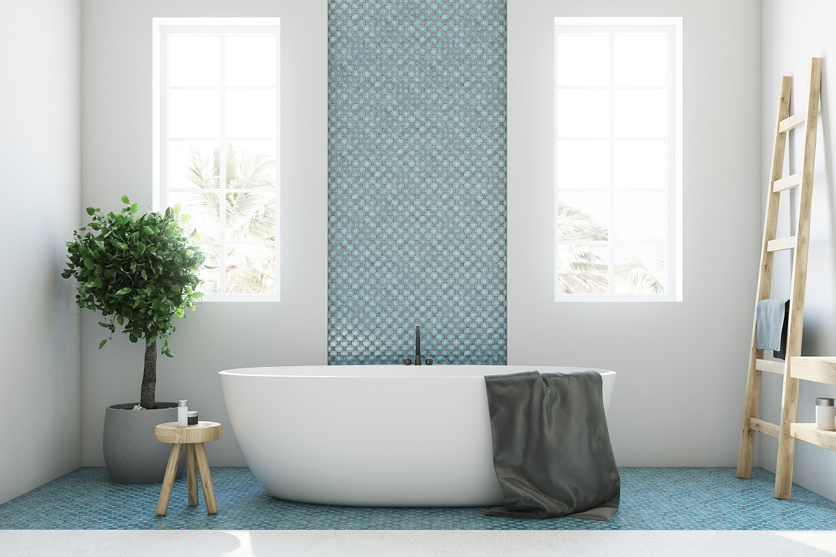
When it comes to great bathroom colour schemes to try, soft grey walls are a nice place to start, mixed with white wood cabinets and fixtures with neutral trimmings like bathmats and blinds. The soothing cool tones that this scheme will provide will emanate feelings of calm and can always be made more vibrant with the addition of a colourful towel or shower curtain.
With a lovely big bath and walk-in shower, why not keep the aqua theme going with a tranquil light or sky-blue colour scheme? Light shades of blue on the walls will go perfectly with white tiles and towels, providing a clean, peaceful, and spa-like atmosphere for your bathroom. If you can accentuate your white floor tiles and cabinets with subtle blue details to compliment your walls, all the better.
Luke Arthur Wells, an interior designer, spoke to us about his advice for bathroom colour schemes, recommending the following: “A simple way to create a bathroom colour scheme that feels calm and restorative is to take inspiration from nature. Biophilic design is based on the idea that nature can be drawn upon to create an environment that benefits our physical and mental health, even in our homes. Green tones draw from plants and flowers and can be easily uplifted by brighter colours for extra energy. For a more subtle scheme, look to stone hues.”
Kitchen colour schemes
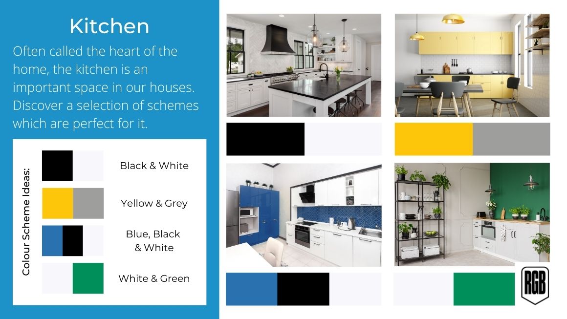
It’s often said that the kitchen is the heart of the home, with many using the space as the main social hub of their house from family meals to large get-togethers. Because of this, the kitchen is a great place to experiment with colour and create a bold look.
There are a lot of facets to a kitchen that can really appeal to a monochromatic look, with tiles, kitchen furniture, cupboards and storage and even the crockery you may have on show being items that can follow a simple scheme. Using a bright yellow colour scheme may seem bold but contrasted with some darker greys can add some amazing energy to a kitchen space.
Another great idea for the kitchen is to bring the outside in. For many, the kitchens are the gateways to our gardens and, especially in the summer months, the two can easily mould into one with BBQs and garden parties. If this sounds like your home, why not try to reflect the garden colour scheme of your outside space in your kitchen to allow the two areas to flow freely?
Hallway, stairs and landing colour schemes
You may not have spent much time considering colour schemes for your hall, stairs and landing, but this area is usually the one that welcomes you home and brings every room of your house together.
Because they do connect so much of the house, it’s common to keep colour schemes for hallways minimal, especially when individual rooms may have bold and bright colour schemes themselves. A crisp white hallway paint can keep this small and often an only artificially lit space bright and airy, whilst not contrasting with any other colour palettes you may have used in your home.
Alternatively, if you would like to keep some colour throughout the hallway, landing and stairs why not consider a pastel colour scheme? These lighter colours will still allow the space to feel bigger but with subtle pastel hues, it can still keep an element of warmth.
Tips for picking the perfect colour scheme
- Assess your space first
- Use a colour wheel
- Consider how light impacts colour
- Take into account the type of space you have
- Test out your colours
- Remember that taste is personal
We hope this guide has been helpful. The world of colour schemes is subjective and personal in many ways and unique to your particular space. However, there are concrete steps you can take to help your decision making. So please use the tips and advice above. We wish you the best of luck with your decorating efforts and we are here to help if you need any painting and decorating supplies.
For more tips, guides, and advice, make sure to visit our blog.
